
The label exact, the skin real.
Beauty Shooting Guidelines for AI Production
In beauty the pack has to be perfect and the skin has to look like skin. Every side of the pack shot without glare, a macro of the label, and three bare-faced angles of the model are what we direct texture, shine and finish from.
The rule
Every side of everything that has to stay the same.
Front, side and three-quarter for the product and for the person, pet or room it appears with; the back for every product; and a close-up of the logos, labels and textures that are hardest to reproduce. Together they let us keep it exact from any viewpoint the campaign needs.
Front0°
Fixes the design: shape, symmetry, label, face.
Side90°
Gives depth and proportions the front hides.
Three-quarter45°
Shows volume the way most campaign shots see it.
Back180°
Products only: seams, closures, back labels and claims the front never shows.
Close-upDetail
Logos, labels, hardware and texture, sharp and flat to the camera.
01 · The product
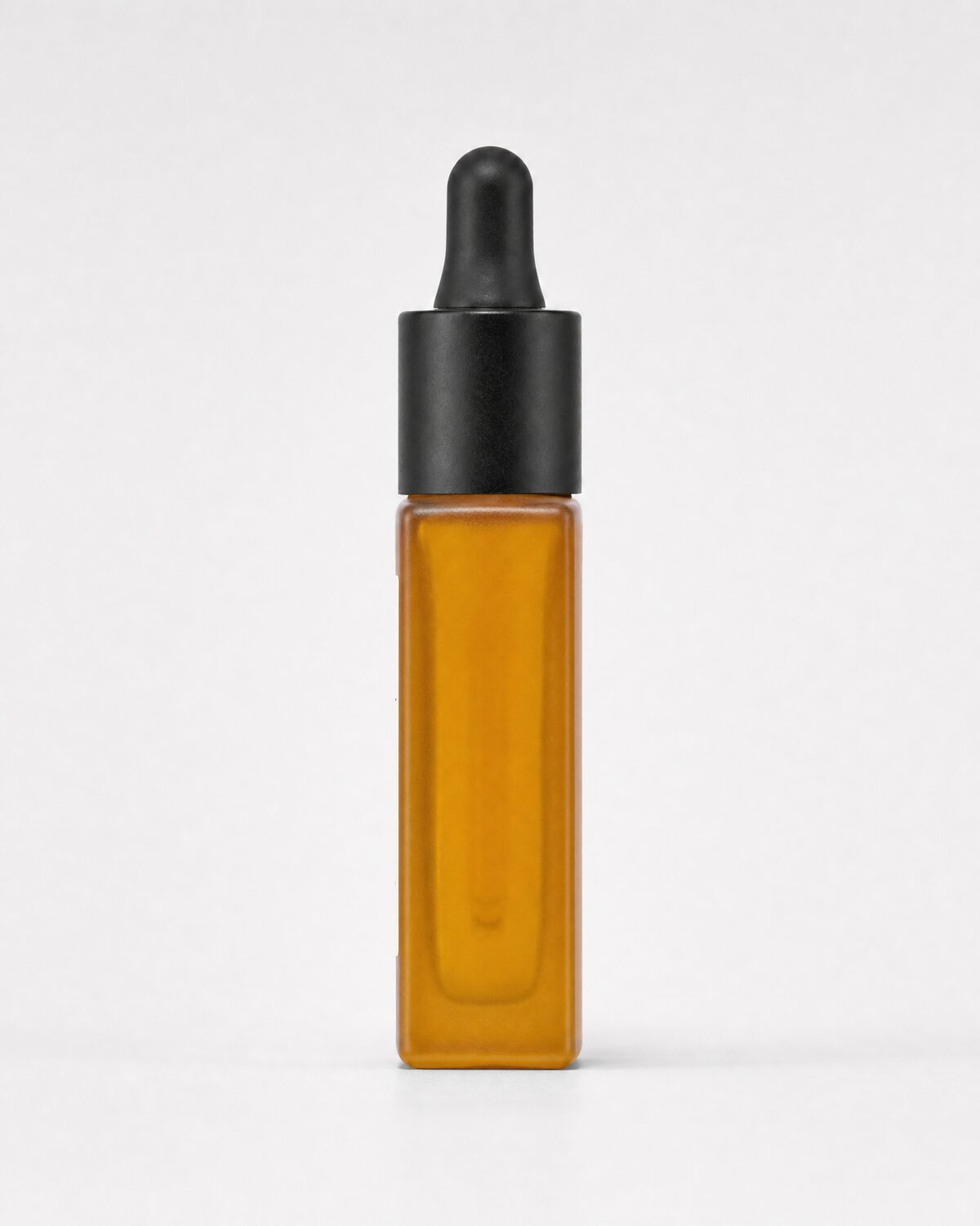
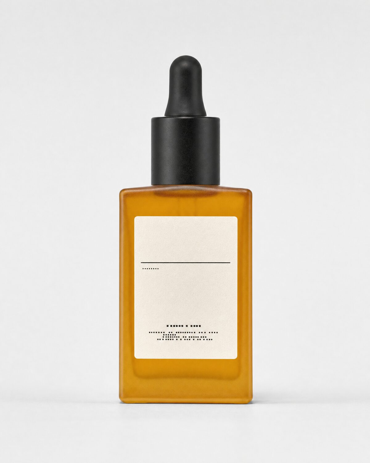
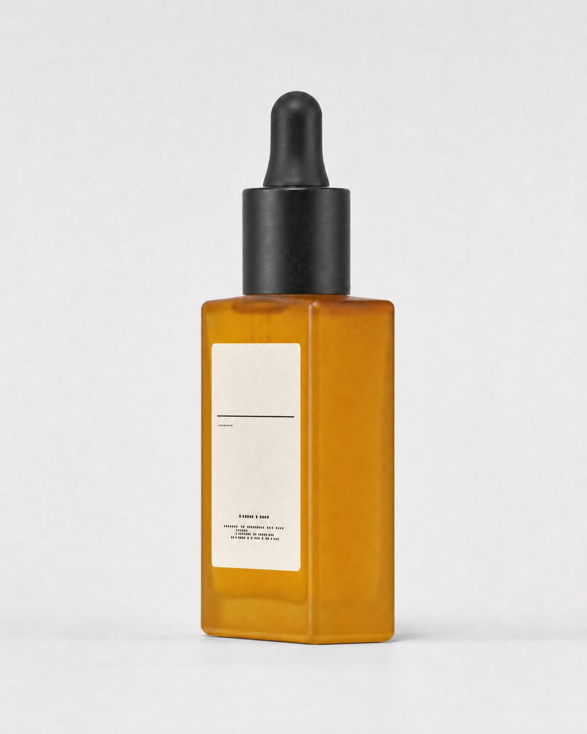
The product: four angles and a close-up.
Example: Amber glass serum bottle with dropper. Click a frame to see it full size.
02 · The face
The face: three angles and a close-up.
Example: Beauty casting reference, bare skin. Click a frame to see it full size.
Studio basics
Eight rules for every reference.
A professional set is not required: a clean wall, a window or two softboxes and a recent camera or phone are enough if these hold.
Light
Large, soft, even light from the front and both sides. No hard shadows, no blown highlights, no mixed daylight and tungsten.
Background
Seamless light grey or white, the same for every shot. A plain wall works if it is clean and evenly lit.
Framing
The whole product or person in frame, with margin on every side. Nothing cropped: what is cut off has to be invented.
Focus
Sharp from edge to edge. Close the aperture (f/8 to f/11) so labels, seams and textures are all readable.
Colour
Neutral white balance and true-to-life colour. Add one frame with a colour card next to the product if you can.
Close-ups
Logos, labels, engravings, hardware and fabric shot macro, flat to the camera and without glare. Fine detail is the hardest thing to reproduce, so we need it in full.
Every variant
One set per colourway, size, shade or finish. We never derive one colour or finish from another.
Files
At least 3000 px on the long edge, JPG or PNG, straight out of the camera. No filters, no retouching, no compression.
What to avoid
- Cropped edges, cut-off feet or a missing cap
- Shot from above with a wide-angle lens, so proportions bend
- Reflections of the room on glass, metal or lacquer
- Coloured walls or mixed light that tint the product
- Filters, beauty retouching or background removal done before sending
- One photo standing in for several colourways or sizes
Your references, our production
Turn your beauty references into a season of campaigns.
Send us your site and we’ll set up a call: what your photos can become, AI commercials, ads, editorials and product content, art-directed by our team, and the cost breakdown.
Beauty references, answered
How do you keep a beauty product’s label exact in AI production?
From a sharp, glare-free front view of the pack and the label artwork as a file. Our team checks every frame against the original, so text, logo and colours stay exactly as printed.
Does skin look real in AI beauty content?
It does when the references are real: bare skin, no filters, soft light. We direct texture, shine and finish shot by shot, and checking for plastic-looking skin is part of every review.
Can you show the texture of a formula?
Yes. Photograph the formula as a swatch on glass and on skin, in daylight, and we keep its colour and finish in every close-up, from a cream’s peak to a serum’s drop.
Why front, side, three-quarter and back views?
Each angle carries information the others hide. The front fixes the design and the label, the side gives depth and proportions, the three-quarter shows the volume the way most campaign shots see it, and for products the back holds seams, closures and back labels. Together they let our art directors keep a product or a person exact from any angle in AI production.
Do you need close-ups of logos and labels?
Yes. Logos, label typography, engravings, hardware and fabric weave are the details hardest to reproduce, so we need each one photographed macro, sharp, flat to the camera and without glare, next to the angle shots. Send the logo and label artwork as files too.
What technical specs should reference photos have?
At least 3000 px on the long edge, JPG or PNG, sharp from edge to edge, neutral white balance, no filters and no retouching. Use a plain light-grey or white background and soft, even light. Photos taken with a recent phone work if they follow these rules.